,
ISLR Ch. 6 Exercise 9e and update 9g (assigned for HW 2)
looking back at your HW 2 answers for context
A
Split the data set into a training set and a test set.
[1] 777B
Fit a linear model using least squares on the training set, and report the test error obtained.
attach(College)
lm.fit <- lm(Apps ~., data = College, subset = train)
lm.pred <- predict(lm.fit, College.test, type = "response")
lm_mse <- mean((College.response -lm.pred )^2)
paste("The Test Error for Least squares is :", lm_mse)
[1] "The Test Error for Least squares is : 1389123.27022729"MSE_dataframe <- data.frame("model" = "Least Square", "MSE" = lm_mse)
C
Fit a ridge regression model on the training set, with λ chosen by cross-validation. Report the test error obtained.
library(glmnet)


x <- model.matrix(Apps~.,College)[,-1]
y <- College$Apps
grid <- 10^seq(10,-2, length = 100)

ridge.mod <- glmnet(x[train,], y[train], alpha =0, lambda = grid )
cv.out <- cv.glmnet(x[train,], y[train],alpha = 0)
plot(cv.out)

lamda_best <- cv.out$lambda.min
paste("The minimum lambda: ",lamda_best)
[1] "The minimum lambda: 364.338366117653"ridge.pred <- predict(ridge.mod, s = lamda_best, newx = x[-train,])
ridge_mse <- mean((ridge.pred - y[-train])^2)
MSE_dataframe <- rbind(MSE_dataframe, c("ridge",ridge_mse))
paste("The test Error Rate is : ", mean((ridge.pred - y[-train])^2))
[1] "The test Error Rate is : 1204431.39092091"D
Fit a lasso model on the training set, with λ chosen by crossvalidation. Report the test error obtained, along with the number of non-zero coefficient estimates.
lasso.mod <- glmnet(x[train,],y[train],alpha = 1, lambda = grid)
cv.out <- cv.glmnet(x[train,], y[train], alpha = 1)
plot(cv.out)

lamda_best <- cv.out$lambda.min
lamda_best
[1] 2.133937lasso.pred <- predict(lasso.mod, s= lamda_best, newx = x[-train,])
paste("The test error rate is ",mean((lasso.pred - y[-train])^2))
[1] "The test error rate is 1374692.34765744"lasso_mse <- mean((lasso.pred - y[-train])^2)
out <- glmnet(x,y, alpha = 1 ,lambda = grid)
lamda.coef <- predict(out, type = "coefficients", s= lamda_best)[1:18,]
paste("The number of non-zero coeficients:",lamda.coef[lamda.coef !=0] %>% length())
[1] "The number of non-zero coeficients: 18"None of the coefficients are zero.
E
Fit a PCR model on the training set, with M chosen by crossvalidation. Report the test error obtained, along with the value of M selected by cross-validation.
library(pls)
set.seed(10)

pcr.fit <- pcr(Apps ~ . , data = College, subset = train, scale = TRUE, validation = "CV")
validationplot(pcr.fit, val.type = "MSEP")

pcr.pred <- predict(pcr.fit,College.test, ncomp = 17)
pcr_mse<- mean((pcr.pred - College.response)^2)
paste("The MSE error is ", pcr_mse)
[1] "The MSE error is 1389123.27022729"summary(pcr.fit)
Data:   X dimension: 583 17
    Y dimension: 583 1
Fit method: svdpc
Number of components considered: 17

VALIDATION: RMSEP
Cross-validated using 10 random segments.
       (Intercept)  1 comps  2 comps  3 comps  4 comps  5 comps
CV            3859     3788     2101     2110     1777     1665
adjCV         3859     3788     2096     2107     1760     1648
       6 comps  7 comps  8 comps  9 comps  10 comps  11 comps
CV        1659     1657     1612     1553      1550      1554
adjCV     1653     1652     1603     1548      1545      1549
       12 comps  13 comps  14 comps  15 comps  16 comps  17 comps
CV         1559      1565      1569      1509      1203      1141
adjCV      1555      1561      1565      1494      1192      1132

TRAINING: % variance explained
      1 comps  2 comps  3 comps  4 comps  5 comps  6 comps  7 comps
X      32.234    57.24    64.47    70.25    75.57    80.51    84.26
Apps    5.038    71.82    71.83    80.10    82.98    83.03    83.15
      8 comps  9 comps  10 comps  11 comps  12 comps  13 comps
X       87.58    90.56     92.82     94.93     96.73     97.81
Apps    84.46    84.98     85.20     85.20     85.20     85.34
      14 comps  15 comps  16 comps  17 comps
X        98.69     99.35     99.82    100.00
Apps 85.44 89.94 92.83 93.36From the validation plot, the lowest MSEP for the number of components is around 16,17, and 18.I decided to use 17 as my value of M.
F
Fit a PLS model on the training set, with M chosen by crossvalidation. Report the test error obtained, along with the value of M selected by cross-validation.
pls.fit <- plsr(Apps~., data = College, subset = train, scale = TRUE, validation = "CV")

validationplot(pls.fit, val.type = "MSEP")

pls.pred_7<- predict(pls.fit, College.test, ncomp = 7)
pls.pred_8 <- predict(pls.fit, College.test, ncomp = 8)

paste("The MSE error using M as 7: ", mean((pls.pred_7- College.response)^2))
[1] "The MSE error using M as 7: 1336641.93400001"[1] "The MSE error using M as 8: 1362535.73332994"The lowest msep was with the number of components ranging from 7 and greater. For the comparison bar chart, I used the msep of 8.
G
Comment on the results obtained. How accurately can we predict the number of college applications received? Is there much difference among the test errors resulting from these five approaches?
| model | MSE |
|---|---|
| ridge | 1204431.39092091 |
| PLS | 1362535.73332994 |
| Lasso | 1374692.34765744 |
| Least Square | 1389123.27022729 |
| PCR | 1389123.27022729 |
MSE_dataframe$MSE <- as.numeric(MSE_dataframe$MSE)

MSE_dataframe %>% ggplot2::ggplot(aes(x = model, y = MSE)) + geom_col(fill = "deepskyblue3")+ theme(axis.text.y = element_blank())+labs(title = "MSE per Model")+geom_text(aes(label = round(as.numeric(MSE),0)), vjust = 2)

The Ridge regression model had the lowest MSE, with PLS coming up the second lowest MSE, following Lasso and the PCR and Least square in last. There is not too much of a difference between the MSE’s, except for the ridge model.
ISLR Ch. 12, Exercise 8
In Section 12.2.3, a formula for calculating PVE was given in Equation 12.10. We also saw that the PVE can be obtained using the sdev output of the prcomp() function. On the USArrests data, calculate PVE in two ways:
- Using the sdev output of the prcomp() function, as was done in Section 12.2.3.
pr.out <- prcomp(USArrests, scale = TRUE)

pr.var <- pr.out$sdev^2
pve<- pr.var/sum(pr.var)
x<- (pve %>% round(3))

cat("PVE using Prcomp: ",x)
PVE using Prcomp: 0.62 0.247 0.089 0.043par(mfrow = c(1,2))
plot(pve, xlab = "Principle Component", ylab = "Proportion of Variance Explained", ylim = c(0,1), type = "b")
plot(cumsum(pve), xlab = "Principle component", ylab = "Cumulative Proporition of Variance Explained", ylim = c(0,1), type = "b")

- By applying Equation 12.10 directly. That is, use the prcomp() function to compute the principal component loadings. Then, use those loadings in Equation 12.10 to obtain the PVE. These two approaches should give the same results.

loadings <- pr.out$rotation
loadings
                PC1        PC2        PC3         PC4
Murder   -0.5358995  0.4181809 -0.3412327  0.64922780
Assault  -0.5831836  0.1879856 -0.2681484 -0.74340748
UrbanPop -0.2781909 -0.8728062 -0.3780158  0.13387773
Rape     -0.5434321 -0.1673186  0.8177779  0.08902432
## Need scaled and matrix version of USArrests
US_mat_scale <- data.matrix(scale(USArrests))
## Getting sum of Sum of squared coefficients in matrix
sum_sq <- sum(apply(US_mat_scale^2,2,sum))
### Top side of 12.10 loadings * matrix coefficients
top_eq <- apply((US_mat_scale %*% loadings)^2,2,sum)
cat("PVE using the 12.10 equation: ",top_eq/sum_sq)
PVE using the 12.10 equation: 0.6200604 0.2474413 0.0891408 0.04335752At first for the sum of squared coefficients in the bottom of the equation. I only took one sum, and the PVE’s did not match the part in A. After closer inspection of equation 12.10, it shows that we take the sum of the squared coefficients of the matrix, and then we take the sum of that as well. When including that in the equation, PVE’s in part A match part B.
Hint: You will only obtain the same results in (a) and (b) if the same data is used in both cases. For instance, if in (a) you performed prcomp() using centered and scaled variables, then you must center and scale the variables before applying Equation 12.10 in (b).
ISLR Ch. 12, Exercise 9
Consider the USArrests data. We will now perform hierarchical clustering on the states. ### (a) Using hierarchical clustering with complete linkage and Euclidean distance, cluster the states.
US_arrest_mat <- data.matrix((USArrests))
hc.complete <- hclust(dist(US_arrest_mat), method = "complete")

plot(hc.complete, main = "Complete Linkage",xlab = "", sub = "", cex = .9)

The plot shows the states clustered.
(b) Cut the dendrogram at a height that results in three distinct
clusters. Which states belong to which clusters? 12.6 Exercises 551
unscaled <-cutree(hc.complete,3)
unscaled_data <- data.frame(unscaled) %>% rownames_to_column("State") %>% rename("Cluster_unscaled" = unscaled)
unscaled_data %>% group_by(Cluster_unscaled) %>% count()
# A tibble: 3 x 2
# Groups:   Cluster_unscaled [3]
  Cluster_unscaled     n
             <int> <int>
1                1    16
2                2    14
3 3 20unscaled_data%>% filter(Cluster_unscaled==1) %>% select(State) %>% as.list() %>% kable(caption = "Group 1 States")
|
unscaled_data%>% filter(Cluster_unscaled==2) %>% select(State) %>% as.list() %>% kable(caption = "Group 2 States")
|
unscaled_data%>% filter(Cluster_unscaled==3) %>% select(State) %>% as.list() %>% kable(caption = "Group 3 States")
|
The data table can be accessed in the html version.
(c) Hierarchically cluster the states using complete linkage and Euclidean distance, after scaling the variables to have standard deviation one.
US_arrest_mat <- data.matrix(scale(USArrests))

paste("Standard Deviation of Scaled data frame: ",sd(scale(USArrests)))
[1] "Standard Deviation of Scaled data frame: 0.99243368701167"hc.complete <- hclust(dist(US_arrest_mat), method = "complete")
plot(hc.complete, main = "Complete Linkage",xlab = "", sub = "", cex = .9)

scaled <-cutree(hc.complete,3)
Scaled_cluster <- data.frame(scaled) %>% rownames_to_column("State") %>% rename("Cluster_Scaled" = scaled)
Scaled_cluster %>% group_by(Cluster_Scaled) %>% count()
# A tibble: 3 x 2
# Groups:   Cluster_Scaled [3]
  Cluster_Scaled     n
           <int> <int>
1              1     8
2              2    11
3 3 31join <- unscaled_data %>% inner_join(Scaled_cluster, by = "State")
join %>% datatable(caption = "States by Cluster for Scaled and Unscaled")
I first checked to make sure that the sd(scale(US Arrests)) is correctly giving us a SD of ~ 1, which it is. The data tables can be accessed in the html version.
(d)
What effect does scaling the variables have on the hierarchical clustering obtained? In your opinion, should the variables be scaled before the inter-observation dissimilarities are computed? Provide a justification for your answer.
Before answering the question, I will look closer into the cluster results for the scaled and un-scaled clusters.
table(scaled)
scaled
 1  2  3
8 11 31 table(unscaled)
unscaled
 1  2  3
16 14 20
x <- which(scaled==1)
y <- which(unscaled==1)
y <- as.vector(y %>% names())
x <- as.vector(x %>% names())
cat("States that differed in Group 1: ", paste(c(y[!(y %in% x)],x[!(x%in%y)]),","))
States that differed in Group 1: Arizona , California , Delaware , Florida , Illinois , Maryland , Michigan , Nevada , New Mexico , New York , Georgia , Tennessee ,The scaled results group most states into the 3rd group. The un-scaled had an even distribution between group 1 and 2, and the most in group 3.
I’ve also included that states that differs in group 1 for the scaled and un-scaled. This information is not that helpful.
### Scaled
for (group in 1:3){
  print(paste("Group: ",group))
  print(paste("---------------------"))
  print(which(scaled==group)%>% names())
  cat("\n")

}
[1] "Group:  1"
[1] "---------------------"
[1] "Alabama"        "Alaska"         "Georgia"
[4] "Louisiana"      "Mississippi"    "North Carolina"
[7] "South Carolina" "Tennessee"

[1] "Group:  2"
[1] "---------------------"
 [1] "Arizona"    "California" "Colorado"   "Florida"    "Illinois"
 [6] "Maryland"   "Michigan"   "Nevada"     "New Mexico" "New York"
[11] "Texas"

[1] "Group:  3"
[1] "---------------------"
 [1] "Arkansas"      "Connecticut"   "Delaware"      "Hawaii"
 [5] "Idaho"         "Indiana"       "Iowa"          "Kansas"
 [9] "Kentucky"      "Maine"         "Massachusetts" "Minnesota"
[13] "Missouri"      "Montana"       "Nebraska"      "New Hampshire"
[17] "New Jersey"    "North Dakota"  "Ohio"          "Oklahoma"
[21] "Oregon"        "Pennsylvania"  "Rhode Island"  "South Dakota"
[25] "Utah"          "Vermont"       "Virginia"      "Washington"
[29] "West Virginia" "Wisconsin"     "Wyoming"
#USArrests[c("Alabama","Alaska"),]
### unscalled
for (group in 1:3){
  print(paste("Group: ",group))
  print(paste("---------------------"))
  print(which(unscaled==group)%>% names())
  cat("\n")
}
[1] "Group:  1"
[1] "---------------------"
 [1] "Alabama"        "Alaska"         "Arizona"
 [4] "California"     "Delaware"       "Florida"
 [7] "Illinois"       "Louisiana"      "Maryland"
[10] "Michigan"       "Mississippi"    "Nevada"
[13] "New Mexico"     "New York"       "North Carolina"
[16] "South Carolina"

[1] "Group:  2"
[1] "---------------------"
 [1] "Arkansas"      "Colorado"      "Georgia"       "Massachusetts"
 [5] "Missouri"      "New Jersey"    "Oklahoma"      "Oregon"
 [9] "Rhode Island"  "Tennessee"     "Texas"         "Virginia"
[13] "Washington"    "Wyoming"

[1] "Group:  3"
[1] "---------------------"
 [1] "Connecticut"   "Hawaii"        "Idaho"         "Indiana"
 [5] "Iowa"          "Kansas"        "Kentucky"      "Maine"
 [9] "Minnesota"     "Montana"       "Nebraska"      "New Hampshire"
[13] "North Dakota"  "Ohio"          "Pennsylvania"  "South Dakota"
[17] "Utah" "Vermont" "West Virginia" "Wisconsin" summary(USArrests)
     Murder          Assault         UrbanPop          Rape
 Min.   : 0.800   Min.   : 45.0   Min.   :32.00   Min.   : 7.30
 1st Qu.: 4.075   1st Qu.:109.0   1st Qu.:54.50   1st Qu.:15.07
 Median : 7.250   Median :159.0   Median :66.00   Median :20.10
 Mean   : 7.788   Mean   :170.8   Mean   :65.54   Mean   :21.23
 3rd Qu.:11.250   3rd Qu.:249.0   3rd Qu.:77.75   3rd Qu.:26.18
 Max.   :17.400   Max.   :337.0   Max.   :91.00   Max.   :46.00
We do need to scale our data. From the summary above, we can see that we are looking at Murder, Assault, Urban Pop, Rape. To compare population to crimes, we do need to scale it as they are not similar measures.
Murder, Assault and Rape are measured in a similar manner (number of crimes commit ed).
When observing the range which is obtained from the summary Assault seems to have a much higher max than rape and murder. A change in assault will not have as much effect as a change in murder and rape.Therefore, we should scale before clustering for those predictors as well.
ISLR Ch. 12, Exercise 10
In this problem, you will generate simulated data, and then perform PCA and K-means clustering on the data.
(a)
Generate a simulated data set with 20 observations in each of
three classes (i.e. 60 observations total), and 50 variables. Hint:
There are a number of functions in R that you can use to generate data.
One example is the rnorm() function; runif() is another option. Be sure
to add a mean shift to the observations in each class so that there are
three distinct classes.
(b)
Perform PCA on the 60 observations and plot the first two principal component score vectors. Use a different color to indicate the observations in each of the three classes. If the three classes appear separated in this plot, then continue on to part (c). If not, then return to part (a) and modify the simulation so that there is greater separation between the three classes. Do not continue to part (c) until the three classes show at least some separation in the first two principal component score vectors.
pr.out <- prcomp(x)

### The Cols function was used in CH12 of the textbook.
Cols <- function (vec) {
 cols <- rainbow( length( unique(vec)))
 return (cols[as.numeric(as.factor(vec))])
 }

rows = c(rep(1,20), rep(2,20), rep(3,20))

plot(pr.out$x[,1:2], col = Cols(rows), pch = 19, xlab = "PC1", ylab = "PC2")

The three groups are very separated, so I will move onto part c.
(c)
Perform K-means clustering of the observations with K = 3. How well do the clusters that you obtained in K-means clustering compare to the true class labels?
Hint: You can use the table() function in R to compare the true class labels to the class labels obtained by clustering. Be careful how you interpret the results: K-means clustering will arbitrarily number the clusters, so you cannot simply check whether the true class labels and clustering labels are the same.
 [1] 1 1 1 1 1 1 1 1 1 1 1 1 1 1 1 1 1 1 1 1 2 2 2 2 2 2 2 2 2 2 2 2 2
[34] 2 2 2 2 2 2 2 3 3 3 3 3 3 3 3 3 3 3 3 3 3 3 3 3 3 3 3| 1 | 2 | 3 | |
|---|---|---|---|
| -8.00047273863795 | 0 | 1 | 0 |
| -7.76218587245206 | 0 | 1 | 0 |
| -7.00953264596257 | 0 | 1 | 0 |
| -6.852795440002 | 0 | 1 | 0 |
| -6.65708209448566 | 0 | 1 | 0 |
| -6.29348184870245 | 0 | 1 | 0 |
 plot (x, col = (km.out$cluster+1),
main = "K- Means Clustering Results with K = 3",
xlab = "", ylab = "", pch = 19, cex = 2)

rows  1  2  3
   1 20  0  0
   2  0 20  0
   3  0  0 20
The first table was incorrectly comparing the scaled variable to the cluster. To get the correct comparison, I created a rows vector with the correct group by row, using the rep function. For example, the first 20 observations are group 1, so I needed those to be labeled group 1. Each row in the correct table, represents the correct group. The columns 1,2, and 3 represent what the cluster they were categorized in.
All observations were correctly identified, which is shown in the table above.
- Perform K-means clustering with K = 2. Describe your results.
set.seed(25)
km.out <- kmeans(x,2, nstart = 50)

 plot (x, col = (km.out$cluster+1),
main = "K- Means Clustering Results with K = 2",
xlab = "", ylab = "", pch = 19, cex = 2)

rows  1  2
   1 20  0
   2  0 20
   3  0 20
All 20 observations for row 3 were identified as group 2.
- Now perform K-means clustering with K = 4, and describe your results.
set.seed(45)
km.out <- kmeans(x,4, nstart = 50)

 plot (x, col = (km.out$cluster+1),
main = "K- Means Clustering Results with K = 4",
xlab = "", ylab = "", pch = 19, cex = 2)

rows  1  2  3  4
   1  0  0 20  0
   2  0 14  0  6
   3 20  0  0  0
Group 1 and 3 are correctly labeled. Group 2 is split between group 2 and 4.
- Now perform K-means clustering with K = 3 on the first two principal component score vectors, rather than on the raw data. That is, perform K-means clustering on the 60 × 2 matrix of which the first column is the first principal component score vector, and the second column is the second principal component score vector. Comment on the results. 552 12. Unsupervised Learning
 [1] 1 1 1 1 1 1 1 1 1 1 1 1 1 1 1 1 1 1 1 1 2 2 2 2 2 2 2 2 2 2 2 2 2
[34] 2 2 2 2 2 2 2 3 3 3 3 3 3 3 3 3 3 3 3 3 3 3 3 3 3 3 3
plot (x, col = (km.out$cluster+1),
main = "K- Means Clustering Results with K = 3",
xlab = "", ylab = "", pch = 19, cex = 2)

table(rows,km.out$cluster)
rows  1  2  3
   1 20  0  0
   2  0 20  0
   3  0  0 20
All observations were correctly identified using the just the prinicple components 1 and 2.
- Using the scale() function, perform K-means clustering with K = 3 on the data after scaling each variable to have standard deviation one. How do these results compare to those obtained in (b)? Explain.
 [1] 1 1 1 1 1 1 1 1 1 1 1 1 1 1 1 1 1 1 1 1 2 2 2 2 2 2 2 2 2 2 2 2 2
[34] 2 2 2 2 2 2 2 3 3 3 3 3 3 3 3 3 3 3 3 3 3 3 3 3 3 3 3table(rows,clusters)
    clusters
rows  1  2  3
   1 20  0  0
   2  0 20  0
   3  0  0 20
plot (scale(x), col = (km.out$cluster+1),
main = "K- Means Clustering Results with K = 3",
xlab = "", ylab = "", pch = 19, cex = 2)

All observations were correctly identified. There was no difference from part b.
Based on reading for this class, what are the main risks of algorithmic models (machine learning) from a fairness and justice perspective?
From a fairness and justice perspective, machine learning algorithms are both very fair and incredibly not fair. It really depends on the perspective. From a machines point of view, the model is incredibly fair, as the code is doing what it was designed to do. Machine learning algorithms are only as fair as they were designed from a humans perspective. These models will very easily start grouping and stereotyping the observations if the model was created with out really understanding the predictors. Exploratory analysis such as clustering would help identify possible stereotypes that will be utilized if one proceeds with using the model with out understanding the predictors.
From a justice perspective, machine learning models are cruel, and uncaring. If one understands how a machine learning model works, they have an unfair advantage over others/groups who have less information. For example, if I know that a particular company uses a model to sift through resumes that don’t contain these key words (or they may need a certain amount of key words) during their first phase of job hiring/resume accepting. The group that knows of these key words will be able to hack the model, and will rise above others who are more qualified.
What forms of modeling/learning and/or sorts of data may pose particular risks of harm?
Linear/Logistic Models can be harmful. In these models we can easily identify the predictors and there direct effect on the response variable. This means that those with the means can directly affect and hack these models to their benefit. When individuals/groups start hacking the models to benefit themselves this can create a snowball effect where the groups with more resources will start to benefit more and faster, while the groups with less resources will be on the other end of the stick. They will feel the negative effects of the model, and the effects will keep getting worse if there is no intervention in the model. A good example of this is determining whether someone gets a loan/capital. Capital allows individuals to grow and make more capital. To be denied that capital has a huge impact on ones future.
What general strategies might be employed to mitigate these risks?
Clustering would be a good way to mitigate this risks. When we cluster our data, we will start to get a better understanding on the data itself. These data points that we are looking at could be individuals who are directly impacted by our machine learning model. If we cluster, we could identify groups of individuals that are being harmed by this model due to external circumstances that were not included in the model.
Can you think of any methodological advances that might be pursued by computational and statistical researchers in order to help data analysts make “ethically derived” predictions?
Clustering and factor analysis will be a good start. Another idea would be to constantly verify and develop an understanding to the input data, the process flow of data and the actual output. Instead of thinking of these models as a black box and trusting the results. Data scientist and the users of the models in their desired applications need to have a thorough understanding of what they are using. This will help avoid issues like stereotyping. This could also help issues where for some reason, we start receiving bad data. If we have bad data, corrupt or just no longer relevant to the model, and we don’t identify this issue, then the models outputs will no longer be relevant to the application it was set up for. So data verification of all points in the process would be very beneficial to make ethically derived predictions.
(Project update) Data Exploration: Use appropriate methods to explore the data you plan to use for your project. (It’s okay if you change your mind and use a different data set later; this exercise may help you decide.) Include some form of visualization(s) and indications of the unit of analysis, the levels of measurements (e.g.: “9 categorical features–7 dichotomous and 2 with more than two categories– and 14 numerical/quantitative features, for a total of 23), univariate statistics helping characterize the distribution of the features and of the outcome variable (label) you wish to predict if you will be conducting supervised learning for the project. Convey something about relationships among features (predictors). If you are going to use these for prediction, identify any preprocessing you may need to do and options available for cleaning up/transforming data and/or dimension reduction. (Submit with your group or with explanation of why you must work alone.)
I’ve attached my current rough draft of the project which is in the Stock_Analysis Machine Learning RMD file, I will speak to the project here, but the file is attached if needed.
I’ve decided to continue working with the Stock Price Prediction. I have decided against pairing with my Networks class, as I am unaware of the best way to connect this to network analysis at the moment. I’m using Tidyquant to obtain initial stock price indicators such as close,open, high, low, volume and adjusted.
library(tidyverse);library(tidyquant)
library(TTR)
stock_data <- tq_get("AAPL", get = "stock.prices", from = "2018-01-01", to = Sys.Date())
stock_data %>% tail() %>% kable(caption = "Initial Indicators")
| symbol | date | open | high | low | close | volume | adjusted |
|---|---|---|---|---|---|---|---|
| AAPL | 2022-04-07 | 171.16 | 173.36 | 169.85 | 172.14 | 77594700 | 172.14 |
| AAPL | 2022-04-08 | 171.78 | 171.78 | 169.20 | 170.09 | 76515900 | 170.09 |
| AAPL | 2022-04-11 | 168.71 | 169.03 | 165.50 | 165.75 | 72246700 | 165.75 |
| AAPL | 2022-04-12 | 168.02 | 169.87 | 166.64 | 167.66 | 79265200 | 167.66 |
| AAPL | 2022-04-13 | 167.39 | 171.04 | 166.77 | 170.40 | 70618900 | 170.40 |
| AAPL | 2022-04-14 | 170.62 | 171.27 | 165.04 | 165.29 | 75237500 | 165.29 |
summary(stock_data)
    symbol               date                 open
 Length:1080        Min.   :2018-01-02   Min.   : 35.99
 Class :character   1st Qu.:2019-01-29   1st Qu.: 49.06
 Mode  :character   Median :2020-02-25   Median : 71.42
                    Mean   :2020-02-23   Mean   : 89.53
                    3rd Qu.:2021-03-22   3rd Qu.:128.89
                    Max.   :2022-04-14   Max.   :182.63
      high             low             close
 Min.   : 36.43   Min.   : 35.50   Min.   : 35.55
 1st Qu.: 49.63   1st Qu.: 48.44   1st Qu.: 48.91
 Median : 72.94   Median : 71.07   Median : 72.26
 Mean   : 90.57   Mean   : 88.54   Mean   : 89.60
 3rd Qu.:130.47   3rd Qu.:127.08   3rd Qu.:129.00
 Max.   :182.94   Max.   :179.12   Max.   :182.01
     volume             adjusted
 Min.   : 41000000   Min.   : 34.46
 1st Qu.: 83736500   1st Qu.: 47.75
 Median :107158650   Median : 71.28
 Mean   :122012055   Mean   : 88.56
 3rd Qu.:143015200   3rd Qu.:127.97
 Max.   :426510000   Max.   :181.78
Above is the initial summary of the Apple price data from 2018 to 4/12/2022. I can change the date to any date I need. The summary show that volume is already very different compared to the other variables. This means that it might be useful to scale the volume variable. Especially during the unsupervised analysis of the variables.
library(ggplot2)
library(lubridate)

stock_data %>% select(-volume,-symbol) %>% pivot_longer(!date, names_to = "prices") %>% ggplot()+
  geom_line(aes(x = date, y = value, group = prices, color = prices))+ ylab("$")

stock_data %>% select(-volume,-symbol)%>% filter(year(date)>=2022) %>% pivot_longer(!date, names_to = "prices") %>% ggplot()+
  geom_line(aes(x = date, y = value, group = prices, color = prices))+ ylab("$")

The first plot is a bit hard to read. The second plot shows that all 5 variables are closely related and follow similar patterns.
I then used the TTR package to create other indicators that are reliant on the variable listed above. I ended up creating 63 more variables.
ADX<- ADX(stock_data[,c("high","low","close")])
aroon<- aroon(stock_data[,c("high","low")],n = 20)
ATR <- ATR(stock_data[,c("high","low","close")],n =14)
BBands_HLC <- BBands(stock_data[,c("high","low","close")])
stock_data$CCI <-  CCI(stock_data[,c("high","low","close")])
stock_data$caikinAD <-chaikinAD(stock_data[,c("high","low","close")],stock_data[,c("volume")])
stock_data$volatility <- chaikinVolatility(stock_data[,c("high","low")])
stock_data$clv <- CLV(stock_data[,c("high","low","close")])
stock_data$CMF <- CMF(stock_data[,c("high","low","close")],stock_data[,c("volume")])
stock_data$PriceDPO <- DPO(stock_data[,"close"])
stock_data$volumeDPO <- DPO(stock_data[,'volume'])
DVI <- DVI(stock_data[,"close"])
EMV <- EMV(stock_data[,c("high","low")],stock_data[,c("volume")])
gmma <- GMMA(stock_data[,"close"])
KST <- KST((stock_data[,"close"]))
stock_data$OBV <- OBV(stock_data[,"close"], stock_data[,"volume"])
pbands <- PBands(stock_data[,"close"])
stock_data$roc <- ROC(stock_data[,"close"])
stock_data$mom <- momentum(stock_data[,"close"])
stock_data$RSI <- RSI(stock_data[,"close"])
stock_data$RSI_MA1 <- RSI(stock_data[,"close"], n = 14, maType="WMA", wts=stock_data[,"volume"])
stock_data$RSI_MA2 <- RSI(stock_data[,"close"], n = 14, maType=list(maUp=list(EMA),maDown=list(WMA)))
sar <- SAR(stock_data[,c("high","low")])
stochOSC <- stoch((stock_data[,c("high","low","close")]))
stock_data$stochWPR <- WPR(stock_data[,c("high","low","close")])
tdi <- TDI(stock_data[,"close"], n = 30)
trix <- TRIX(stock_data[,"close"])
stock_data$ema <- EMA(stock_data[,"close"],n = 20)
stock_data$sma <- SMA(stock_data[,"close"],n = 20)
macd <-MACD(stock_data[,"close"])
stock_data$ult.osc <- ultimateOscillator(stock_data[,c("high","low","close")])
stock_data$vhf.close <- VHF(stock_data[,"close"])
stock_data$vhf.hilow <- VHF(stock_data[,c("high","low","close")])
ohlc <- stock_data[,c("open","high","low","close")]
stock_data$vClose <- volatility(ohlc, calc="close")
stock_data$vClose0 <- volatility(ohlc, calc="close", mean0=TRUE)
stock_data$vGK <- volatility(ohlc, calc="garman")
stock_data$vParkinson <- volatility(ohlc, calc="parkinson")
stock_data$vRS <- volatility(ohlc, calc="rogers")
stock_data$WilliamsAD <- williamsAD(stock_data[,c("high","low","close")])
stock_data$zigzag <- ZigZag(stock_data[,c("high", "low")], change =20)


Technical_data <- stock_data %>% cbind(ADX, aroon, ATR, BBands_HLC[,4],EMV,gmma,KST[,1],macd,sar,stochOSC,tdi,trix[,1])
Technical_data %>% tail()
     symbol       date   open   high    low  close   volume adjusted
1075   AAPL 2022-04-07 171.16 173.36 169.85 172.14 77594700   172.14
1076   AAPL 2022-04-08 171.78 171.78 169.20 170.09 76515900   170.09
1077   AAPL 2022-04-11 168.71 169.03 165.50 165.75 72246700   165.75
1078   AAPL 2022-04-12 168.02 169.87 166.64 167.66 79265200   167.66
1079   AAPL 2022-04-13 167.39 171.04 166.77 170.40 70618900   170.40
1080   AAPL 2022-04-14 170.62 171.27 165.04 165.29 75237500   165.29
           CCI   caikinAD  volatility        clv       CMF PriceDPO
1075  30.76443 5332294217 -0.18457198  0.3048412 0.2980788       NA
1076  12.44864 5308568256 -0.16148337 -0.3100788 0.3368096       NA
1077 -37.50007 5246554802 -0.14323658 -0.8583569 0.3542440       NA
1078 -36.20482 5217352141 -0.09773150 -0.3684172 0.2972747       NA
1079 -29.05147 5266801888 -0.01491211  0.7002339 0.2808814       NA
1080 -79.15384 5197602700  0.11862902 -0.9197433 0.2068932       NA
     volumeDPO        OBV          roc       mom      RSI  RSI_MA1
1075        NA 2848428200  0.001802466  0.309997 53.20987 63.19102
1076        NA 2771912300 -0.011980408 -2.050003 50.02667 57.74470
1077        NA 2699665600 -0.025847056 -4.339996 44.02233 46.88903
1078        NA 2778930800  0.011457514  1.910004 47.03520 47.17787
1079        NA 2849549700  0.016210436  2.739990 51.10116 44.06507
1080        NA 2774312200 -0.030447115 -5.110001 44.27480 37.33494
      RSI_MA2  stochWPR      ema      sma  ult.osc vhf.close
1075 49.49968 0.4500000 171.0684 168.8275 53.57478 0.3715260
1076 42.67319 0.6476195 170.9752 169.5955 52.55162 0.3708939
1077 32.55327 0.9822821 170.4776 170.3520 49.25463 0.3661973
1078 38.20065 0.8469168 170.2092 170.9805 47.24924 0.3588705
1079 45.88849 0.6527290 170.2274 171.5210 46.22569 0.3603307
1080 35.21704 0.9828415 169.7572 171.7545 41.91386 0.3547379
     vhf.hilow    vClose   vClose0       vGK vParkinson       vRS
1075 0.3868640 0.2545168 0.2560820 0.1783655  0.1867755 0.1680521
1076 0.3862058 0.2564217 0.2634813 0.1769035  0.1872174 0.1664821
1077 0.3813153 0.2413001 0.2818854 0.1785024  0.1868448 0.1688485
1078 0.3736861 0.2643839 0.2868434 0.1879066  0.1903925 0.1808082
1079 0.3752065 0.2796668 0.2834864 0.1927481  0.1993515 0.1834448
1080 0.3693828 0.3165469 0.3322602 0.2067391  0.2205364 0.1931955
     WilliamsAD zigzag      DIp      DIn         DX      ADX aroonUp
1075   109.6326     NA 26.01623 25.80385  0.4098398 18.69673      70
1076   107.5826     NA 24.67990 25.61407  1.8574155 17.49392      65
1077   103.2426     NA 22.71795 29.98601 13.7903369 17.22938      60
1078   105.1526     NA 22.55171 27.84618 10.5053538 16.74909      55
1079   108.7826     NA 22.90941 25.79191  5.9187302 15.97550      50
1080   102.8026     NA 20.52971 25.99728 11.7513830 15.67377      45
     aroonDn oscillator       tr      atr trueHigh trueLow
1075      10         60 3.509995 4.176717   173.36  169.85
1076       5         60 2.940002 4.088380   172.14  169.20
1077       0         60 4.589996 4.124210   170.09  165.50
1078       0         55 4.119995 4.123909   169.87  165.75
1079       0         50 4.269989 4.134343   171.04  166.77
1080       0         45 6.230011 4.284034   171.27  165.04
     BBands_HLC[, 4]           emv         maEMV short lag 3
1075       0.6006326 -0.0001243969 -0.0001059528    173.0066
1076       0.5388931 -0.0003759632 -0.0001408474    171.5483
1077       0.3848170 -0.0015757455 -0.0004282978    168.6491
1078       0.3883671  0.0004034164 -0.0004002282    168.1546
1079       0.4103300  0.0003930250 -0.0002806273    169.2773
1080       0.2479574 -0.0006210345 -0.0002332015    167.2836
     short lag 5 short lag 8 short lag 10 short lag 12 short lag 15
1075    173.6849    173.7160     173.3547     172.8769     172.1293
1076    172.4866    172.9102     172.7611     172.4482     171.8744
1077    170.2411    171.3191     171.4864     171.4177     171.1089
1078    169.3807    170.5059     170.7907     170.8396     170.6778
1079    169.7205    170.4824     170.7196     170.7719     170.6430
1080    168.2436    169.3285     169.7324     169.9286     169.9739
     long lag 30 long lag 35 long lag 40 long lag 45 long lag 50
1075    169.7762    169.3929    169.0921    168.8309    168.5826
1076    169.7965    169.4316    169.1408    168.8856    168.6418
1077    169.5354    169.2271    168.9754    168.7493    168.5283
1078    169.4144    169.1400    168.9112    168.7019    168.4943
1079    169.4780    169.2100    168.9838    168.7757    168.5690
1080    169.2078    168.9923    168.8036    168.6242    168.4404
     long lag 60 KST[, 1]      macd    signal      sar      fastK
1075    168.0704 58.56463 1.5818153 1.4517555 179.6100 0.55000004
1076    168.1366 59.78672 1.3340655 1.4282175 179.2196 0.35238048
1077    168.0584 58.00537 0.9230439 1.3271828 178.6184 0.01771793
1078    168.0453 53.95755 0.6788351 1.1975132 177.5690 0.15308319
1079    168.1225 52.07081 0.6076970 1.0795500 176.6034 0.34727099
1080    168.0297 47.28807 0.3056435 0.9247687 175.7152 0.01715854
         fastD     slowD     tdi        di  trix[, 1]
1075 0.6503514 0.7634155 -179.32 -62.07001 0.07582647
1076 0.5034804 0.6462254 -195.69 -46.15002 0.08680848
1077 0.3066995 0.4868437 -203.04 -38.45001 0.09226573
1078 0.1743939 0.3281912 -217.93 -24.12000 0.09440946
1079 0.1726907 0.2179280 -220.29 -17.03999 0.09538640
1080 0.1725042 0.1731963 -218.44 -17.98000 0.09274961Dimensions of data set: 1080 70I had to cbind some of the variables due to some variables creating nested lists in their column, which messed up the data frame. Cbind was an easy way to bring that in. In order to avoid more issues, I also had to rename some of the columns that were brought in.
Right now all of my variables are numeric.
For pre-processing, I’ll need to remove the date field when predicting. I’ll plan to use each row as a case. Since I’m going to be predicting for multiple dates. I will have to create multiple training and test sets for each specific date I’m predicting. I’ll also have to remove any NA’s that are in the testing and training sets before running the models.
I used PCA to look at the Principle components, most of the predictors in the components had similar weights, this is due to most of my current predictors being based off of the prices listed. For dimension reduction, I’ll look into using different models that will tell me the optimal predictors/trees/shrinkage to be used when predicting price. The models I’m currently using are Least Squares, ridge, lasso, pls, pcr, boosting and bagging.
Here is the current PCA analysis I have. To see the supervised learning process I have going at the moment, please look at the other RMD file.
techincal_indicators <- Technical_data %>% select(-symbol,-zigzag,-PriceDPO,-volumeDPO)


### get rid of the NA's
complete_data <- techincal_indicators[complete.cases(techincal_indicators),]
pr.out <- prcomp((complete_data[-1]), scale. = TRUE)
names(pr.out)
[1] "sdev" "rotation" "center" "scale" "x" #pr.out$center
#pr.out$scale
pr.out$rotation[1:10,1:2]
                    PC1         PC2
open        0.194856508 -0.02020812
high        0.194958375 -0.01977279
low         0.194675395 -0.02203853
close       0.194763953 -0.02167978
volume     -0.042421035  0.08369591
adjusted    0.194771787 -0.02135314
CCI        -0.014447667 -0.21435392
caikinAD    0.185214697 -0.01878782
volatility  0.003844347  0.02905770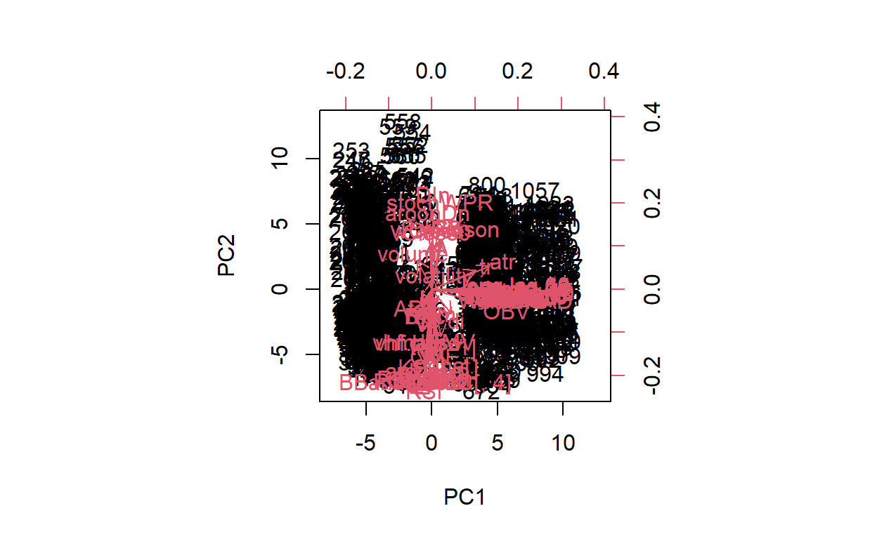
clv -0.006402930 -0.05074345[1] 65 65biplot(pr.out,scale =0)
pr.var <- pr.out$sdev^2
pve <-pr.var/sum(pr.var)
Due to lack of space, I only showed the the first 10 of the loading. But the full loading has 65 rows. The biplot is quite difficult to read due to so many vectors. I’m currently not sure how to limit the vectors shown on the biplot.
par (mfrow = c(1, 2))
plot (pve , xlab = " Principal Component ",
ylab = " Proportion of Variance Explained ", ylim = c(0, 1),
type = "b")
plot ( cumsum (pve), xlab = " Principal Component ",
ylab = " Cumulative Proportion of Variance Explained ",
ylim = c(0, 1), type = "b")

paste("Variance Explained by the top 10 Components: ",pve %>% round(3) %>% as.data.frame()%>% slice(1:10) %>% sum())
[1] "Variance Explained by the top 10 Components: 0.924"The first 10 components account for 92% of variance explained by the model. The PCA unsupervised analysis may not be necessary since I will be running a PCR and PLS model for predictions (please see current project attached for analysis).
For next steps in the process. At the recommendation of the professor, I will bring in addition time based indicators. Specifically, I will look at general economic indicators. Once I bring in this additional information, I will re run the PCA analysis, and I will also look into clustering. I’m curious to see if I may be able to identify certain times where the data would cluster together. For example is there was a recession going on at the time, would the cluster analysis reflect that.’
I plan to also look into setting up training and test sets for time series models. Since I had to create a new training and test set for prediction, I’m a bit unsure how I can compare each predication to each other, since they’ll be running from different samples.